Dynamic View : Visual Representations
The primary use case for Liquid | Author, of which Dynamic View is a component, is interaction with an academic paper so the interactions will be focused on interacting with text primarily, not shapes or other data, though images etc. need to be supported as well.
Determining the exact nature of the type of graph and which types of interactions are most useful in an academic setting is a major research component of the project.
I am starting with the general notion of Ted Nelson’s desire to cut up the text and lay it out in any order. Further opportunities, such as automated layouts and 'magnets' to arrange the layout, is for later.
Quick Video Overview
In this demo you can see how I can move the headings around at will. I then switch back to the word processor view where any new headings have been added to the document, and switches seamlessly and instantly between the two views:
Please note, this was put together using Liquid | Author and Scapple, which is a fantastic current concept map application developed by Literature & Latte. The implementation would look exactly the same, in terms of fonts and colours in word processor and Dynamic View.
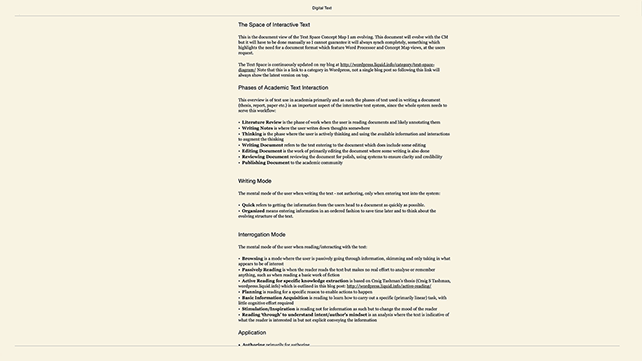
Word Processor View in Author
(normal writing)
As Liquid | Author works today, the author can compress the document to see only Headings (you could call it a Table of Contents view) by pinching in on the track-pad with two fingers.
To transition to Dynamic View the author would pinch in on the track-pad with three fingers:
Collapsed Outline View in Author
(on command this appears for a brief instant)
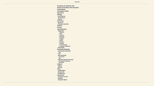
Collapsed Outline View in Author
(which then collapses to show level 1 headings only)
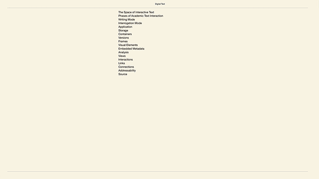
This is what the user would see when first entering Liquid | View; it would be exactly the same as a collapsed document showing the table of contents. The user can now choose to drag the headings around anywhere on the screen.
The Interaction
Mark Anderson likens the interaction to doing a jigsaw puzzle:
The user organizes the information into rough heaps, just as one might organize the blue pieces and the red pieces when doing a jigsaw of a country scene.
Similarly, with the users intellectual work, the user categorises what is already in the document to get a better picture of how different pieces relate and to better see what is missing.
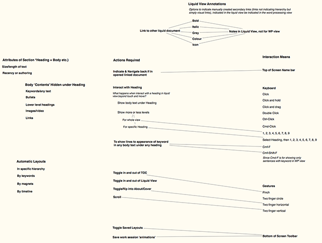
Layout
Here you can see how I have organized the document into two long columns; Action Required and Interaction Means where I have drawn lines between some of the actions required and the means through which we can let the user achieve them, by dragging one heading onto the other.
You can also see other, smaller columns where I am working on different aspects of problems in the document.
The text which is italic was written in this view as a note, and would should up in the WP view as a sub-head.
I have dragged apart items in the columns to create vertical groupings/chunks, while still keeping them in the same column, as you can see most clearly in the Action Required column.
![[Full Size Image on DropBox]](https://www.dropbox.com/s/3ge7wugs4sk0yax/full%20viewScreen%20Shot%202017-02-21%20at%2014.43.30.png?dl=0)
Design Iterations
This is the second design iteration. The Initial Design is also available to review.
© Frode Hegland 2020